
This project aimed at making users understanding the migrants difficulties espacially after a brutal immigration
As both a student UX Designer and grandson of an immigrant, this cause is important to me (and also my 2 other teammates). We wanted to :
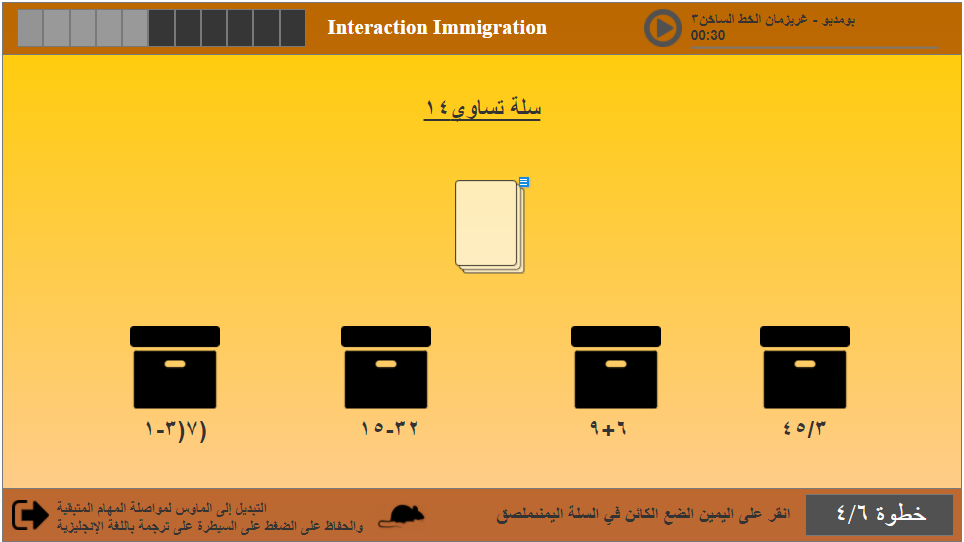
The primary objective of the "Migrant Simulator" project was to simulate the challenges faced by migrants when arriving in a new country, with an emphasis on language and cultural barriers. The project aimed to raise awareness and foster empathy for migrants by putting the user in a simulated scenario that mirrored some of the difficulties they might encounter. The experience involved performing simple tasks that would become increasingly difficult as the user’s interaction mode changed from Kinect gestures to mouse-based control, alongside a sudden language shift from English to Arabic.
One of the main challenges was creating an experience that was both educational and engaging. The task was to design a simulation that would highlight the emotional and psychological strain faced by migrants, including language barriers and changes in technology. We faced the difficulty of balancing a quick, yet impactful experience with providing enough time for users to process the sudden changes they encountered during the simulation. Additionally, we needed to ensure that the design was accessible and that users could understand the task without prior knowledge of the context.
We conducted interviews with students and professors, along with analyzing our class demographics to make decisions about language and task complexity. The goal was to ensure that the tasks were brief (less than 5 minutes) while still managing to capture the user's attention. We wanted to make sure that users, regardless of background, could engage with the experience and understand its purpose.
My study also take in consideration the way that the eye read information, the following picture show how a human being consult an information.
From our research, we learned that most people do not have an understanding of the challenges migrants face when forced to move to a new country. Many were unaware of how difficult it could be to adapt to a new culture and language. We also learned that the sudden shift from one interaction mode to another (from Kinect to mouse) heightened the difficulty of the tasks and added to the feeling of frustration, which closely mirrored the migrant experience.
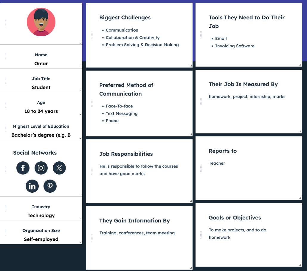
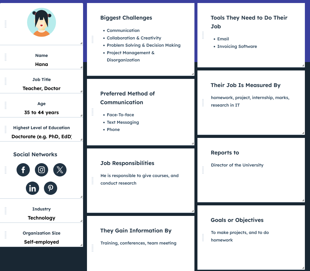
We based our user personas on a diverse range of potential users, aiming to cover different age groups and backgrounds. The personas represented users who might have little to no knowledge about migration issues, which allowed us to tailor the experience for maximum impact. The goal was to create a universally relatable experience that would help anyone, even younger audiences like middle and high school students, understand the emotional toll of migration.
We mapped out the user journey to identify key moments of emotional impact during the experience. Starting with a simple, user-friendly task using Kinect gestures, the user is gradually confronted with unexpected changes in language and interaction mode. This shift is designed to evoke a sense of confusion and frustration, mirroring the experiences of migrants. The user journey was designed to be short but intense, with a time limit of 10 minutes for the entire experience to simulate the pressure and urgency often felt by migrants.
The design process for "Migrant Simulator" involved several phases: from initial brainstorming and concept development to rapid prototyping and user testing. We focused on creating a simple and intuitive interface to guide the user through the tasks. The Kinect technology was chosen for its ability to create an interactive and playful experience, while the sudden switch to mouse-based control was used to introduce a feeling of alienation, symbolizing the challenge of adapting to a new culture. Throughout the process, we constantly iterated on the design to ensure the user experience was both effective and engaging.
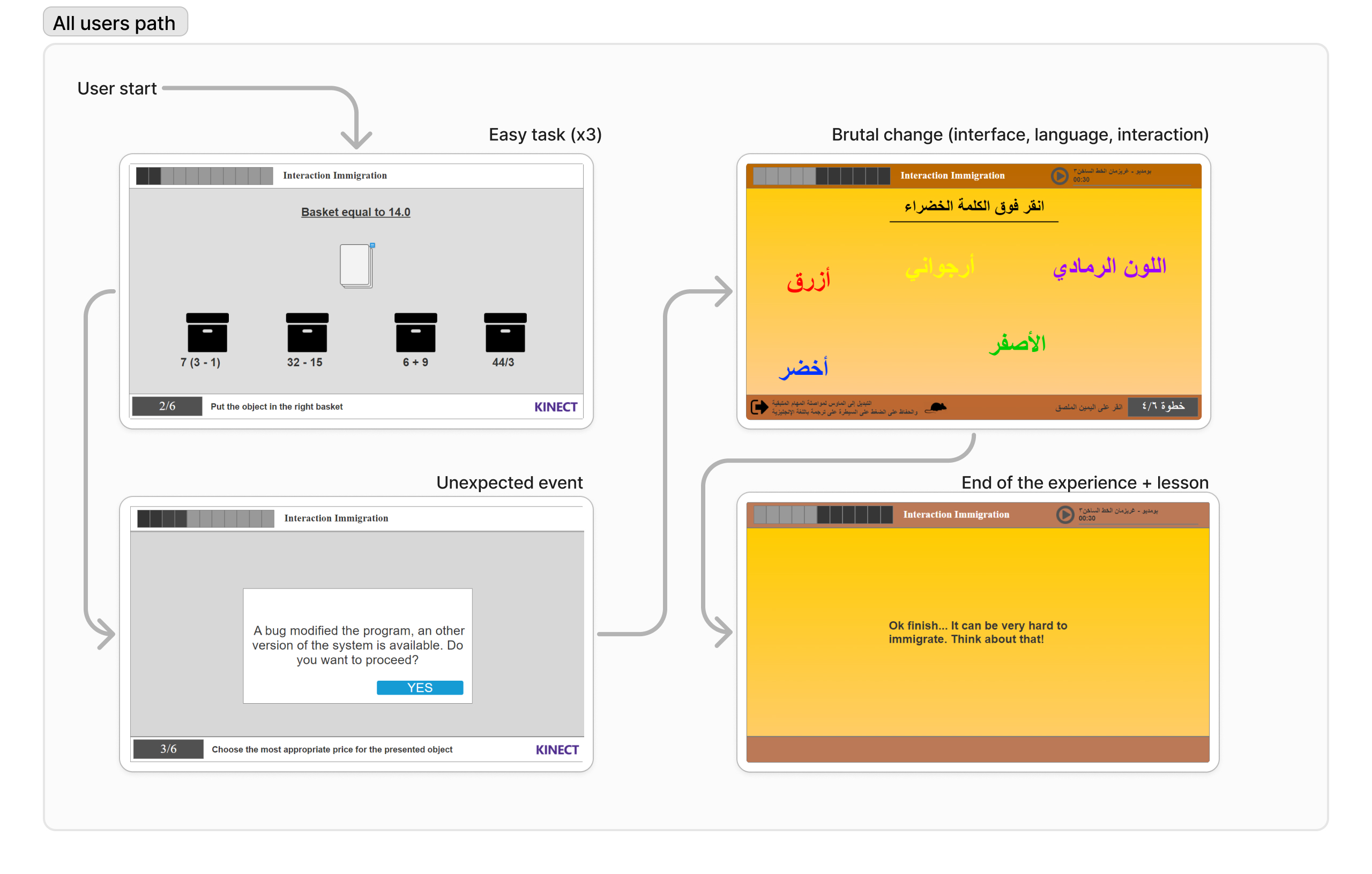
This diagram illustrates the (expected) journey of the users using the app.
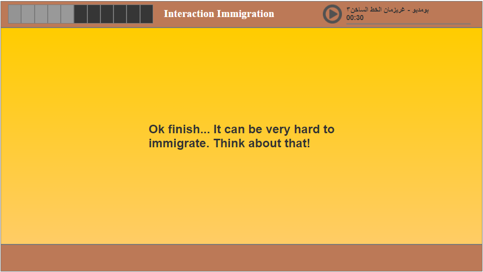
During the exhibition, 16 participants attempted the experience. Only 5 participants successfully completed the tasks, including 2 Arabic speakers. The design's challenge, particularly the sudden language switch and change in interaction method, contributed to this low success rate. The experience generated a lot of discussion and empathy, especially from those who struggled to complete the tasks, who expressed an increased awareness of the difficulties migrants face. A journalist even wrote an article about our work, recognizing its significance in raising awareness about the migrant crisis.
This solution simplifies access, enhances comprehension, and significantly improves usability, particularly for mobile users.
Explore the interactive prototype created with Axure, which simulates the full user journey (here only with mouse/touch)
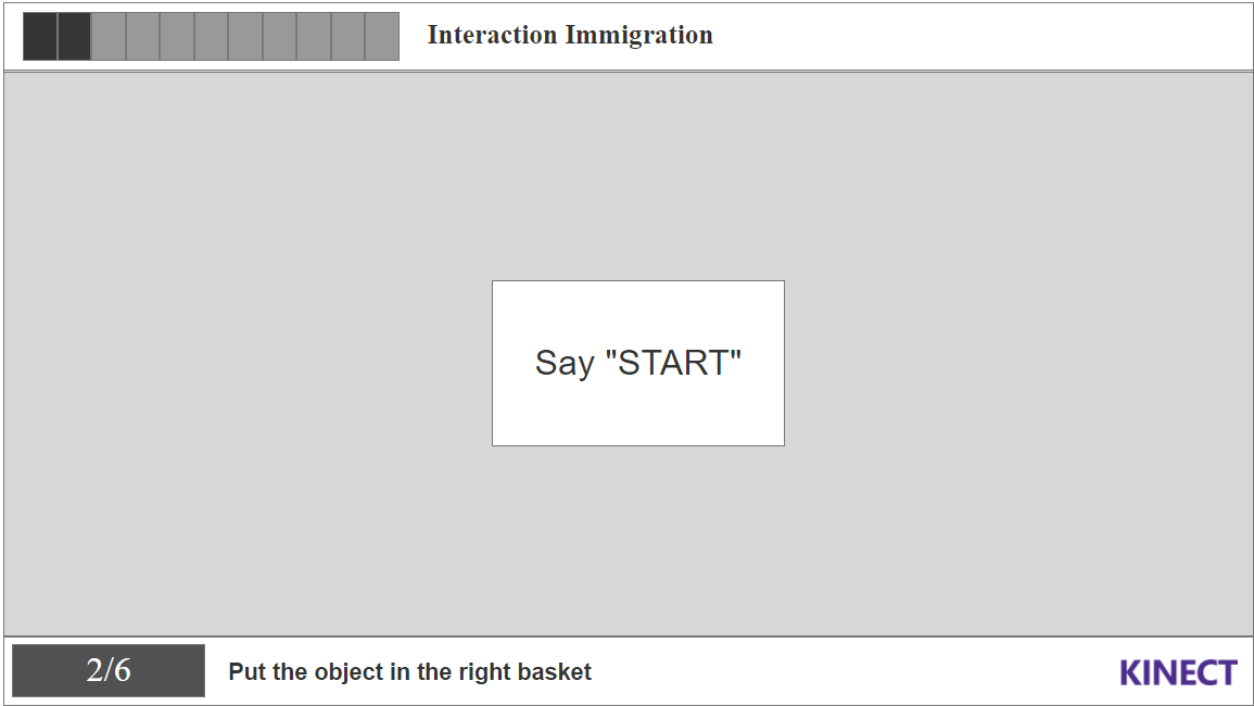
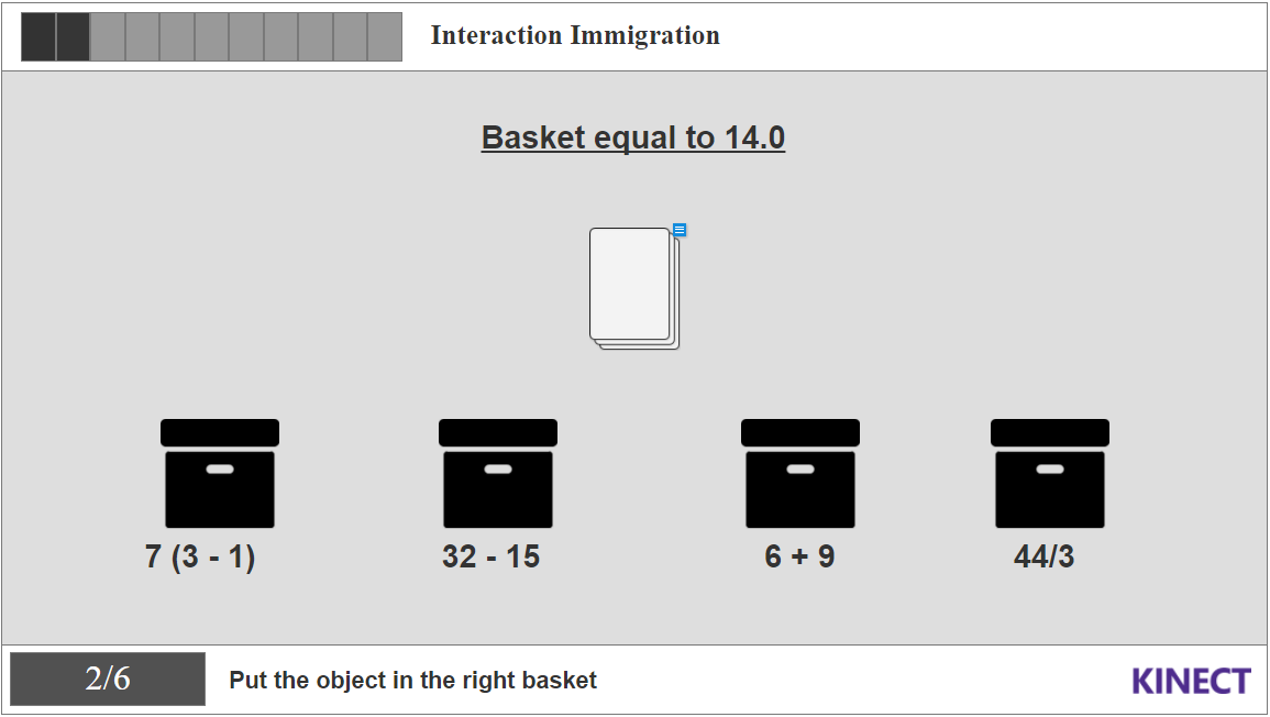
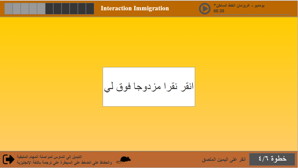
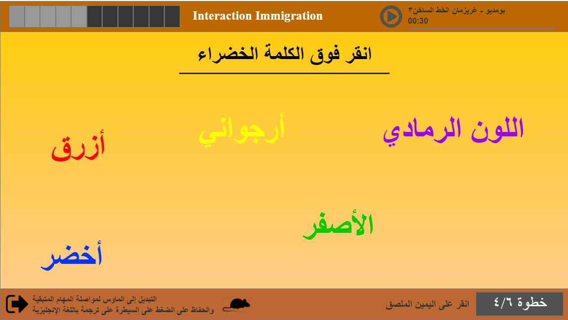
When it say "Say Start", click/tap once, then click/tap double when it say "3/2/1 Go, to select an answer, double click"
Below are the mockups of the key screens in the application, demonstrating how the user interface supports the workflows of date consultation.
The new calendar solution significantly improved user engagement, offering a more accessible and intuitive display, particularly on mobile devices. It addressed prior navigation issues, especially for older clients, and made the process of consulting the payment dates more streamlined. Marketing teams appreciated the flexibility for content management and prioritization.
The design was evaluated using real-world scenarios tailored to different user personas, ensuring usability across demographics.
The "Migrant Simulator" project was a success in raising awareness about the challenges of migration. The immersive experience had a significant emotional impact on participants, with only 5 out of 16 completing the tasks. Notably, 2 Arabic speakers were among the winners, showing the complexity of the task. The project received recognition, including an article by a journalist who highlighted the project’s ability to evoke empathy and understanding. The exhibition was a success, with positive feedback from both participants and visitors. This project has reinforced the importance of using design and technology to address complex social issues.
During the exhibition, 16 participants attempted the experience. Only 5 participants successfully completed the tasks, including 2 Arabic speakers. The design's challenge, particularly the sudden language switch and change in interaction method, contributed to this low success rate. The experience generated a lot of discussion and empathy, especially from those who struggled to complete the tasks, who expressed an increased awareness of the difficulties migrants face. A journalist even wrote (in french) an article about our work, recognizing its significance in raising awareness about the migrant crisis.