This project aimed at improving the user experience for clients managing deferred payments
About my role in this project and my global feeling
As Intern UX Designer at BoursoBank, I had opportunity to work with 2 distinct teams :
✅ As Principal UX Designer (for 6 months) for the Customer Service : my intership allow Bourso Bank to recruit a resource for the customer service (until my arrival, the Infography team were almost totally allocated to the Marketing Department only.
✅ As UX Designer (for 1 month)
in the UX Team of the Marketing Dept. : at the end of my internship, I worked on 2-3 project.
I had 2 challenges here : undestand the bank domain and users' needs & apply my UX skills after my Master's Degree. Fortunately, I had a great team and my internship was a success.
Problem Statement
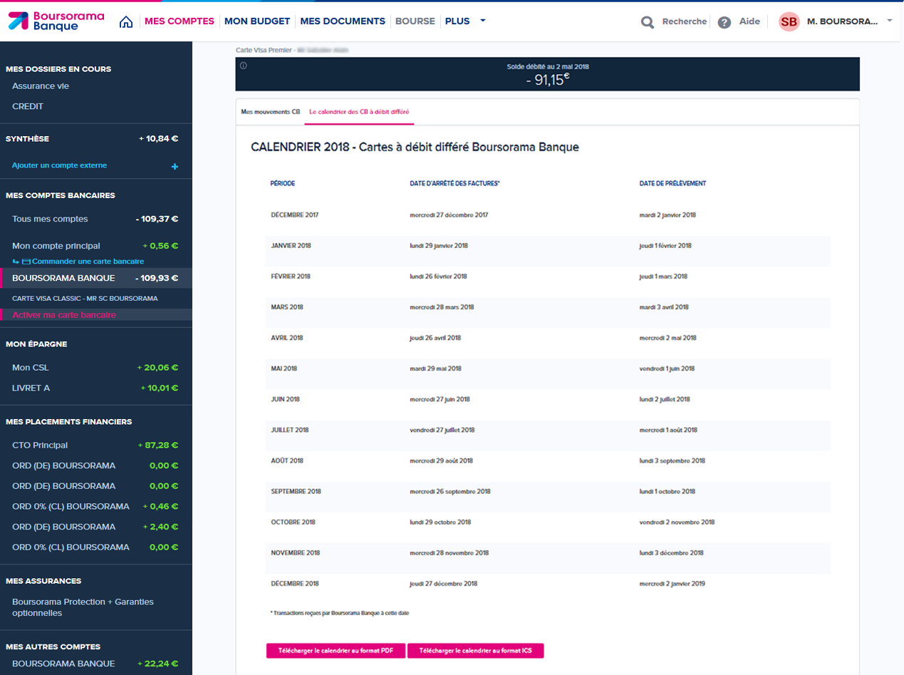
After some weeks in the Customer Service team, I noticed some improvements. One on my first improvement was the display of the calendar for differed credit card. It was only a table, that is terribly not responsive design. I have proposed a new way to display the calendar based on studies, interviews and experience of one of my teammates. For this case, I was the Principal UX Designer.
Challenges and Context
Previously, the calendar feature was displayed as a static table, which created significant frustrations. Users had to manually locate the current month's row, a cumbersome process that was especially problematic on mobile due to the lack of responsive design. Scrolling horizontally and vertically on small screens was inconvenient and impractical. These issues severely impacted usability and customer satisfaction, prompting a complete redesign of the feature.
User Research and Needs Gathering
To design a tool that truly meets user needs, we conducted a series of research activities to understand the frustrations and expectations of clients. Our process included discussions with two team members of BoursoBank, one Customer Service member, one experienced bank manager, and two clients to gain comprehensive insights.
Our User Research Approach
To create a user-centered design, we conducted in-depth research to understand the pain points and needs of both users and stakeholders. Here's how we approached it:
✅ User Interviews: Engaged with diverse clients, including students, retirees, and working professionals, to understand their struggles with the previous tabular design and deferred debit concepts.
✅ Feedback Workshops: Organized sessions with banking and design teams to identify usability challenges and align on solutions.
✅ Surveys: Collected data to validate assumptions about deferred debit clarity and date display preferences.
✅ Process Audit: Evaluated the limitations of the existing display, identifying how it hindered scalability and user satisfaction, especially on mobile platforms.
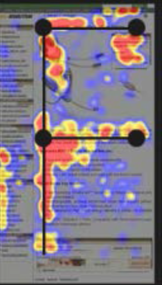
My study also take in consideration the way that the eye read information, the following picture show how a human being consult an information.
What We Learned
Through this research, several recurring issues emerged:
✅ Deferred Debit Confusion: Many users struggled with understanding the concept of deferred debit, highlighting the need for educational content.
✅ Mobile Usability Issues: The old table format was difficult to navigate, especially on mobile devices, where horizontal and vertical scrolling frustrated users.
✅ Preference for Simplicity: Users wanted a clean, straightforward display that shows relevant information (e.g., current month’s debit date) without requiring extra effort to find it.
✅ Need for Educational Support: Users appreciated the option to access explanatory content when needed, but preferred it to be unobtrusive.
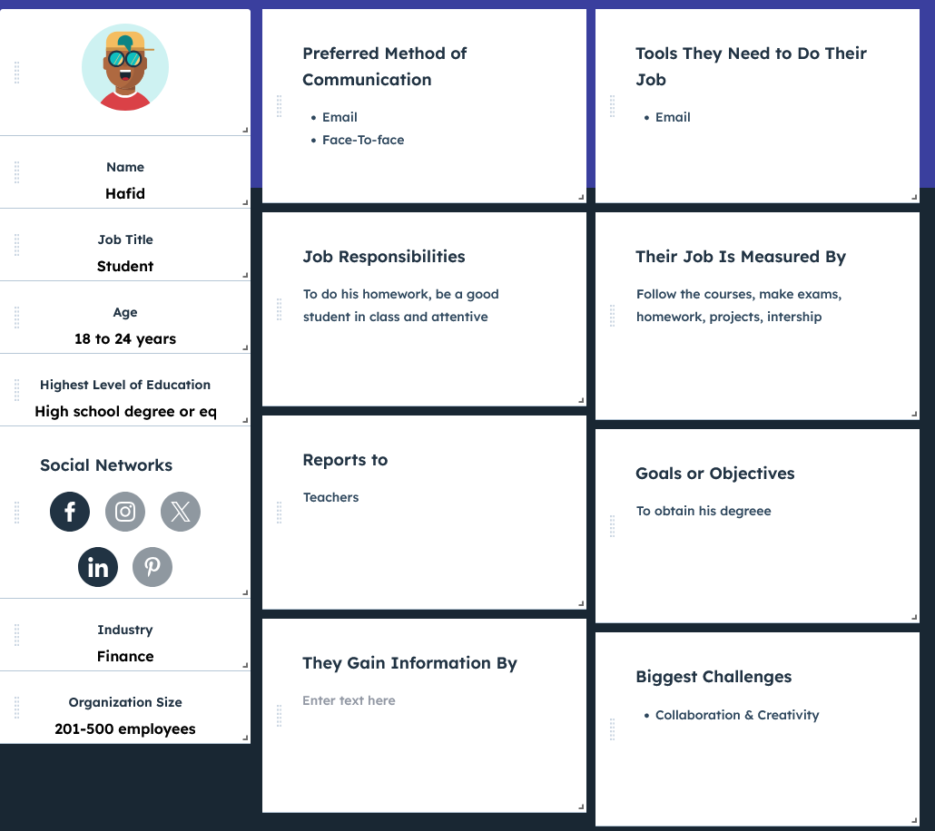
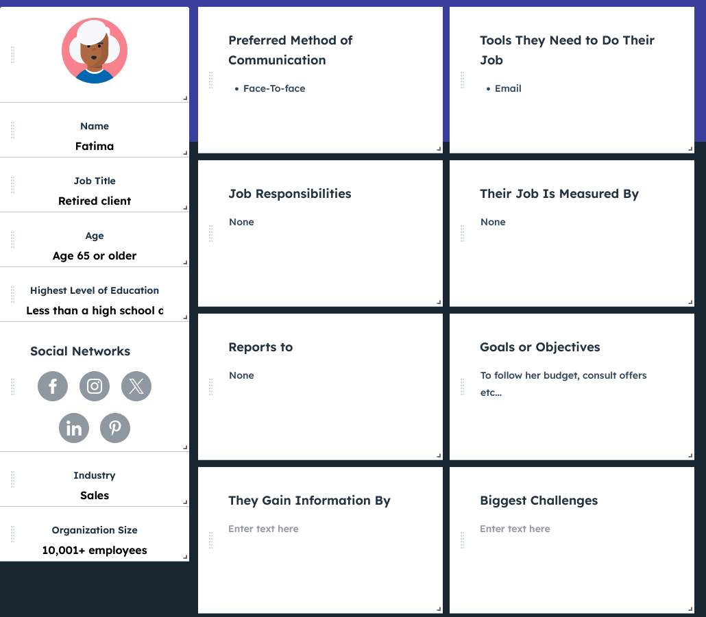
User Personas
To better understand the different types of users, we created personas. These profiles allowed us to define the specific needs and goals of each user group and tailor the tool to their objectives.
A studient client
A senior client
Banking Customer Service Representative
Experienced Banking Manager
User Journey Mapping
Hafid - Student client
Phase: Want to consult date
Emotions: 😟 Confused, 😠 Frustrated
Pain points: Difficulty finding the correct month and information, especially on mobile.
Opportunities: ✅ Mobile-optimized calendar, displaying the current month’s date and offering easy navigation to other months.
Phase: Need to understand benefits
Emotions: 😒 Annoyed, 🙂 Reassured
Pain points: Confusion about the deferred debit system.
Opportunities: ✅ Clear, accessible explanations directly within the calendar interface.
Fatima - Senion client
Phase: Want to consult date
Emotions: 😟 Overwhelmed, 😒 Impatient
Pain points: Difficulty reading the information on mobile due to small text or excessive scrolling.
Opportunities: ✅ Simplified display with minimal scrolling and clear fonts, especially on mobile.
Opportunities: ✅ A help section easily accessible from the calendar interface, explaining the key concepts.
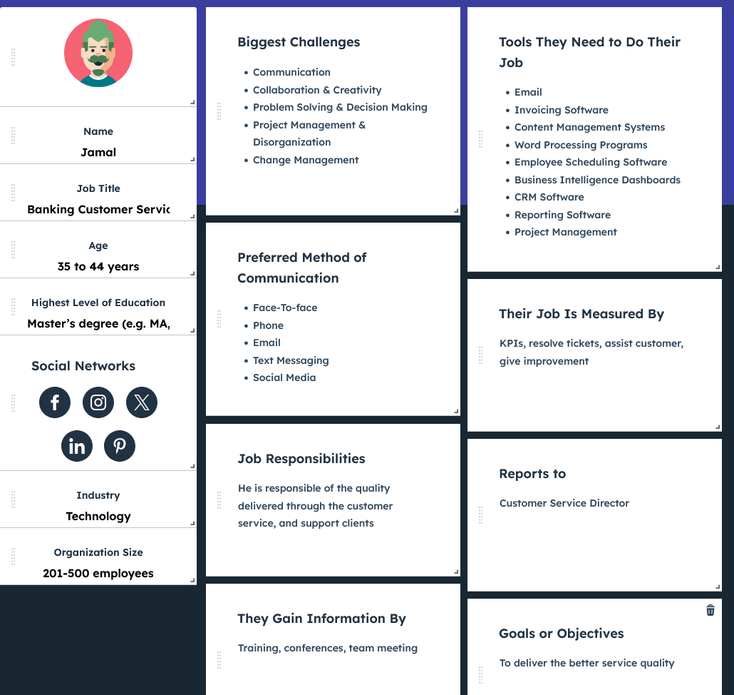
Jamal - Banking Customer Service Representative
Phase: Need to support customers
Emotions: 😤 Frustrated, 😌 Satisfied
Pain points: Receiving multiple customer inquiries about dates or calendar functionalities.
Opportunities: ✅ A clear, easy-to-use calendar that minimizes confusion, reducing support queries.
Phase: Follow-up on issues
Emotions: 😒 Tired, 🙂 Accomplished
Pain points: Repeatedly explaining calendar and offer details to users.
Opportunities: ✅ A demo feature to help customer service representatives guide clients effectively.
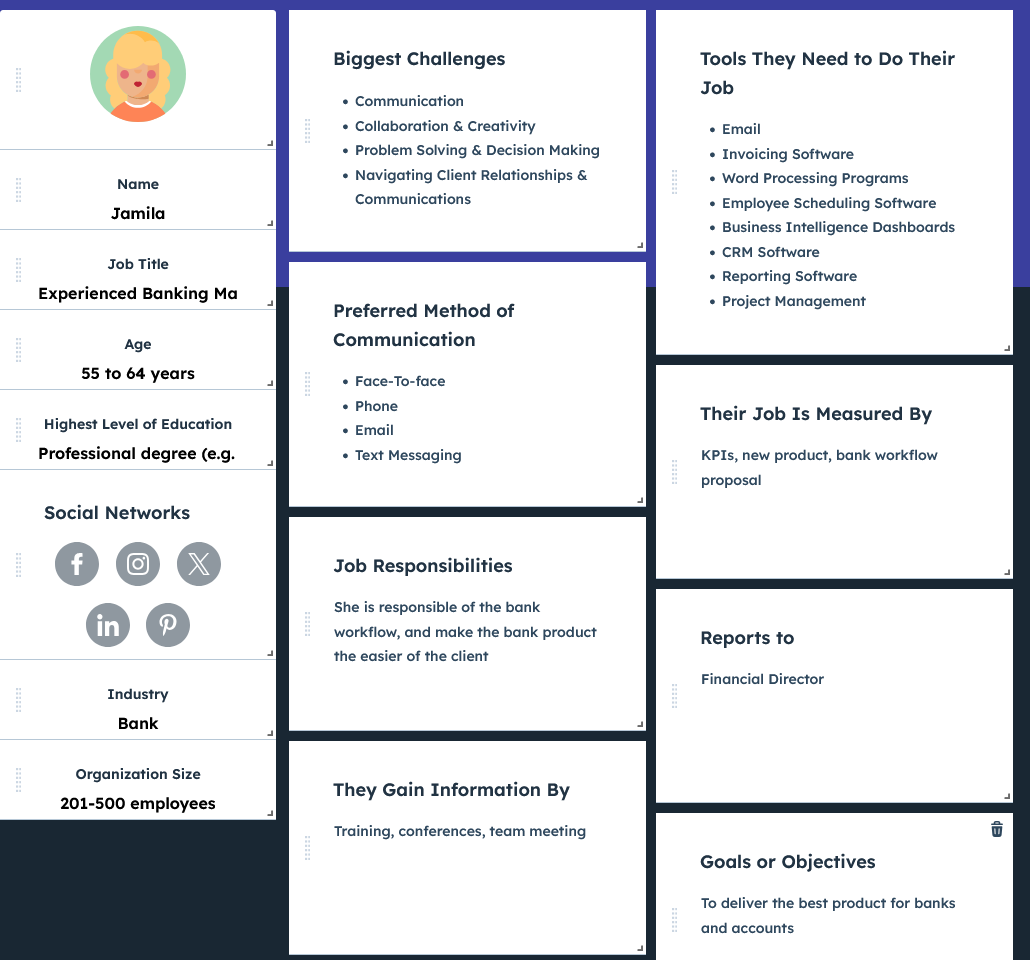
Jamila - Experienced Banking Manager
Phase: Monitor product performance
Emotions: 😟 Concerned, 🙂 Motivated
Pain points: Lack of insight into how customers interact with the calendar feature.
Opportunities: ✅ Analytics tools to track user engagement and improve the product based on insights.
Phase: Strategic planning
Emotions: 😠 Pressured, 🙂 Empowered
Pain points: Difficulties in adapting the calendar for future user segments and business needs.
Opportunities: ✅ A flexible calendar design that can scale according to evolving business goals.
Design Process
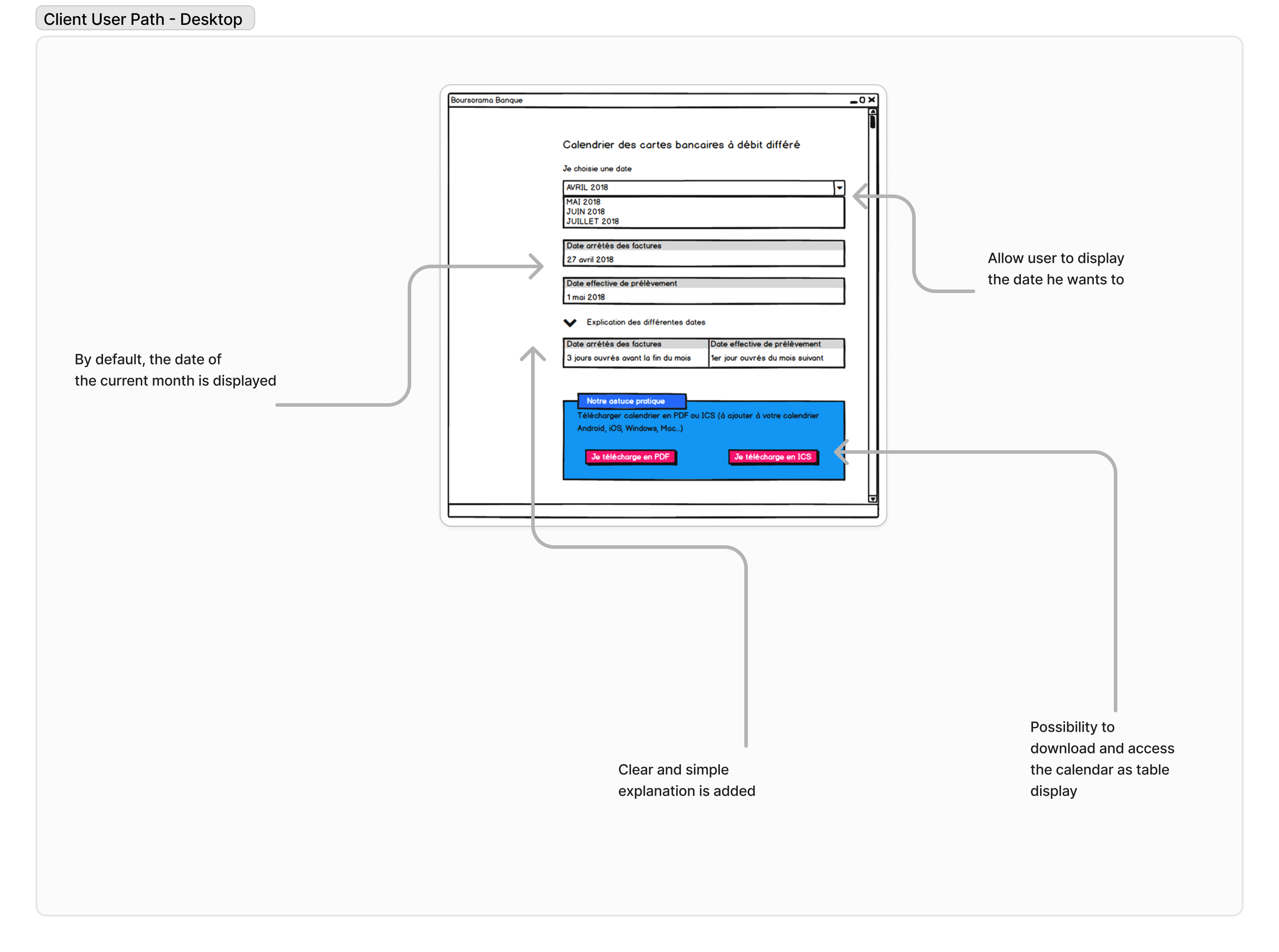
Client Path - Desktop
This diagram illustrates the journey of the cleint using the feature to consult date of deffered credit card calendar with PC.
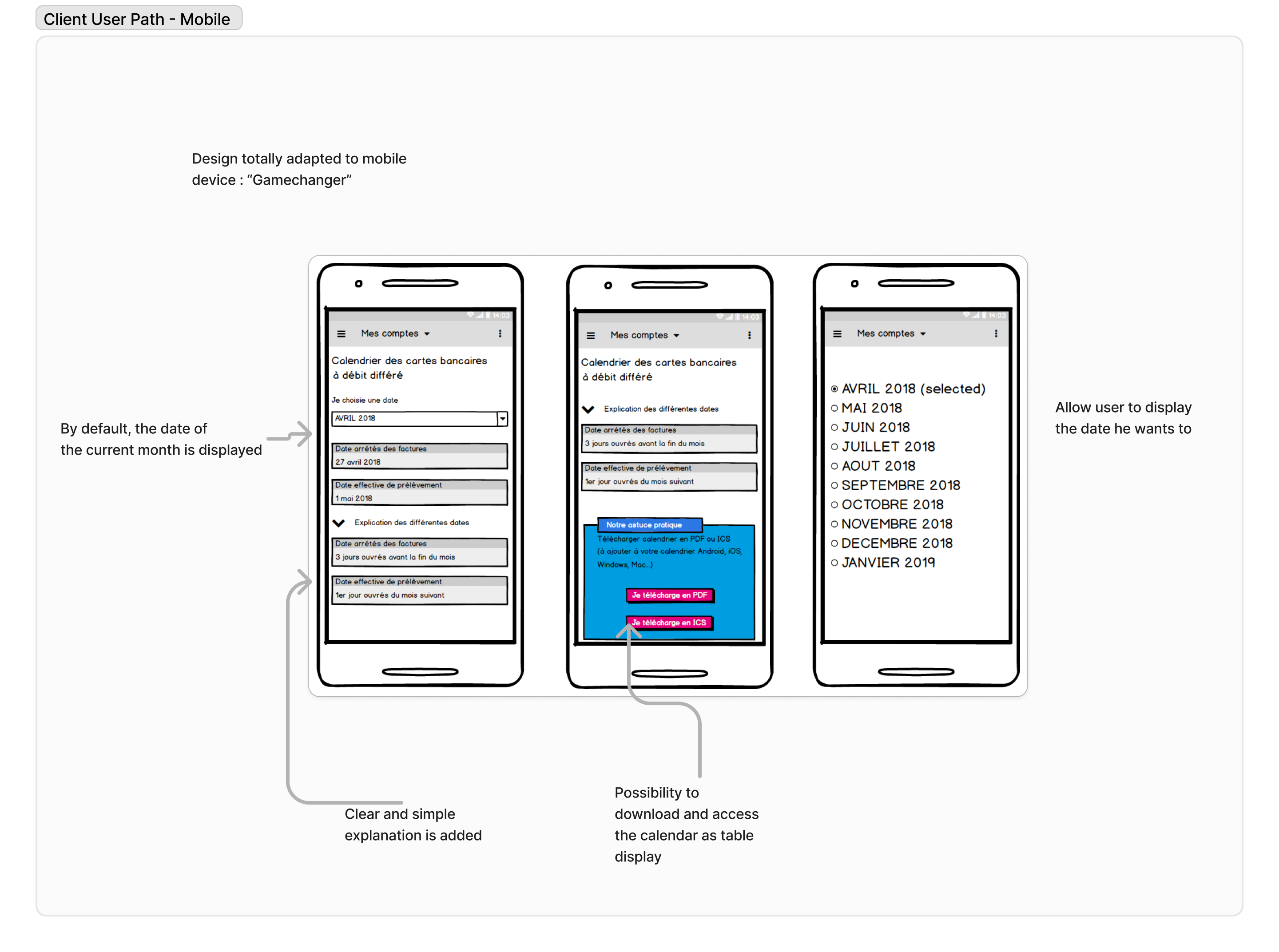
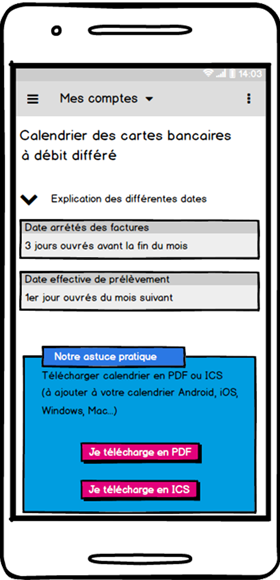
Client Path - Mobile
Here, we see the difference. This design had been adopted directly by users only with the sketch.
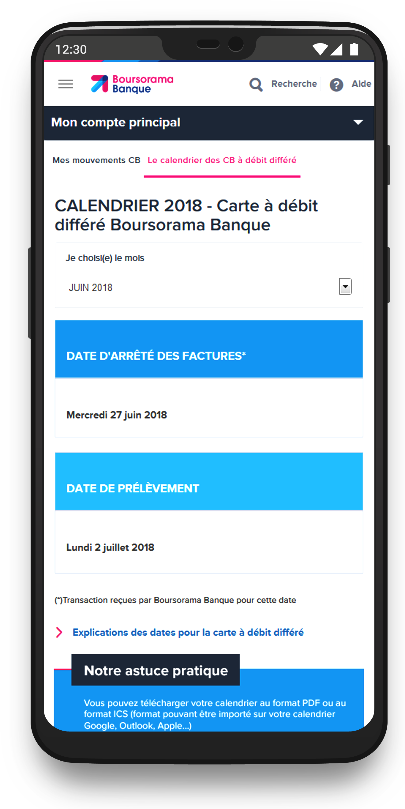
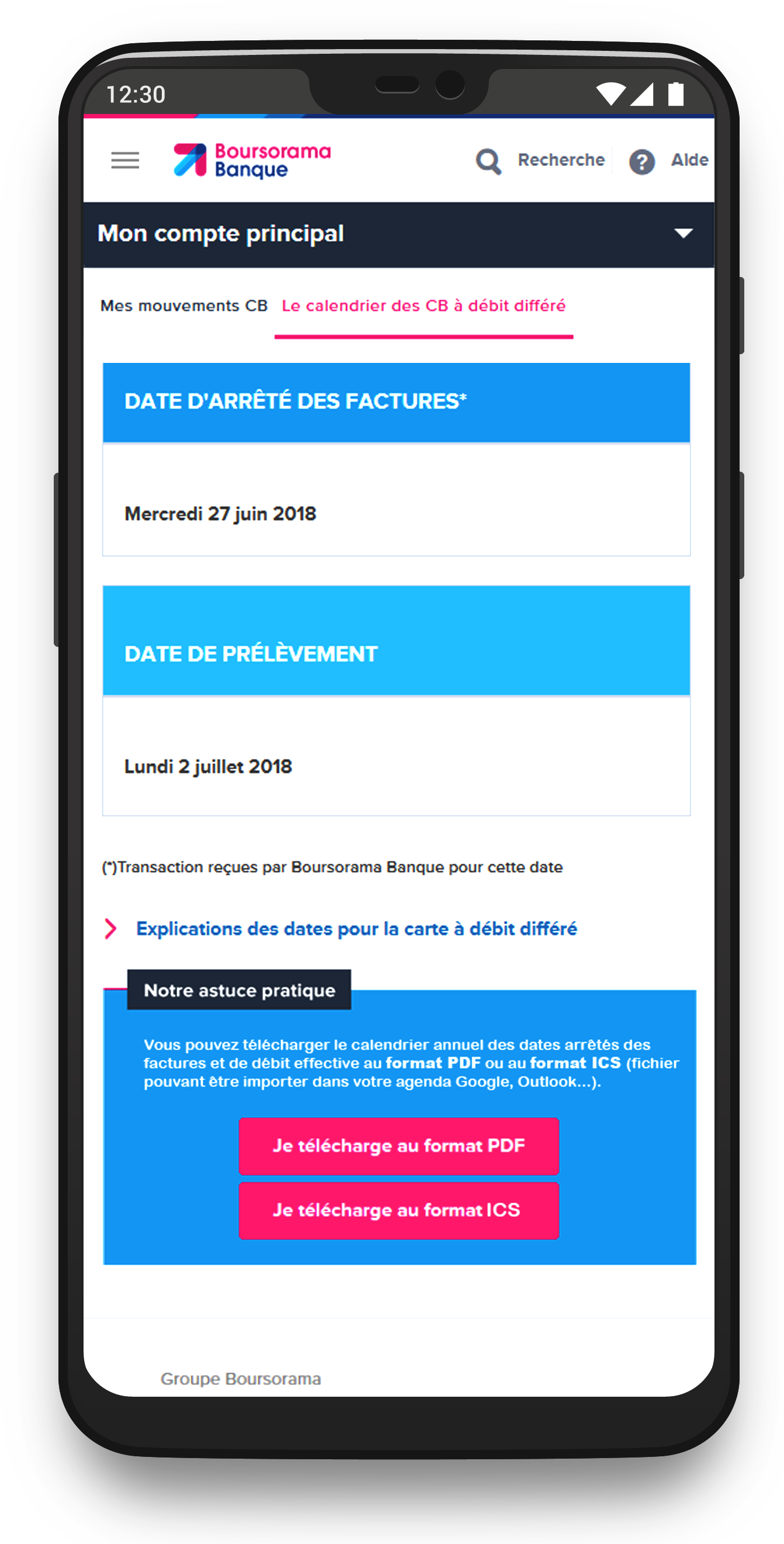
Solution & Features
The revamped calendar offers a clean, user-friendly design focused on displaying essential information while maintaining a seamless mobile experience.
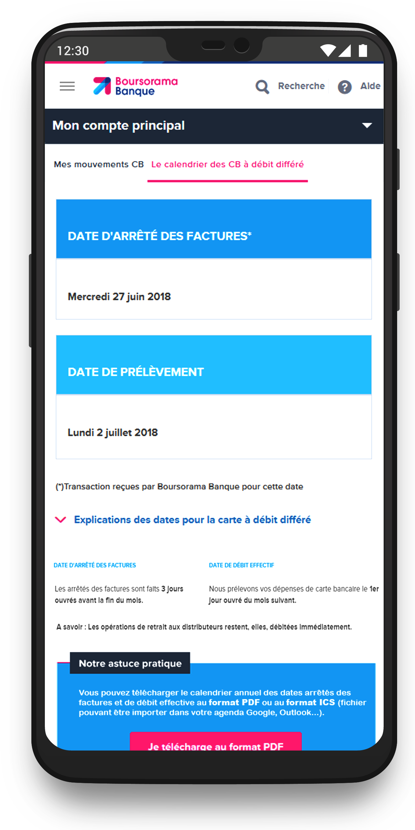
✅ Dynamic Date Display: Automatically shows the debit date for the current month (e.g., November shows November’s date by default), streamlining navigation for users.
✅ Dropdown Menu for Other Dates: Allows users to quickly access dates for other months without overwhelming the interface.
✅ Mobile-Optimized Layout: Ensures an intuitive, clutter-free experience on small screens.
✅ Educational Tooltip: An optional, collapsible guide explaining the concept of deferred debit, addressing a common pain point highlighted during interviews.
This solution simplifies access, enhances comprehension, and significantly improves usability, particularly for mobile users.
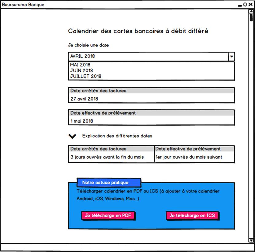
Prototypes & Mockups
Interactive Prototype
Explore the interactive prototype created with Axure, which simulates the full user journey of date for deffered Credit Card consultation.
Below are the mockups of the key screens in the application, demonstrating how the user interface supports the workflows of date consultation.
Date displayed based on current month
Possibility to download a table of all date for the current year
A help is now available to explain deffered credit card system
Test, Impact and Results
The new calendar solution significantly improved user engagement, offering a more accessible and intuitive display, particularly on mobile devices. It addressed prior navigation issues, especially for older clients, and made the process of consulting the payment dates more streamlined. Marketing teams appreciated the flexibility for content management and prioritization.
Test Methodology
The design was evaluated using real-world scenarios tailored to different user personas, ensuring usability across demographics. Feedback was gathered through interviews and workshops, refining features to meet both user and marketing needs.
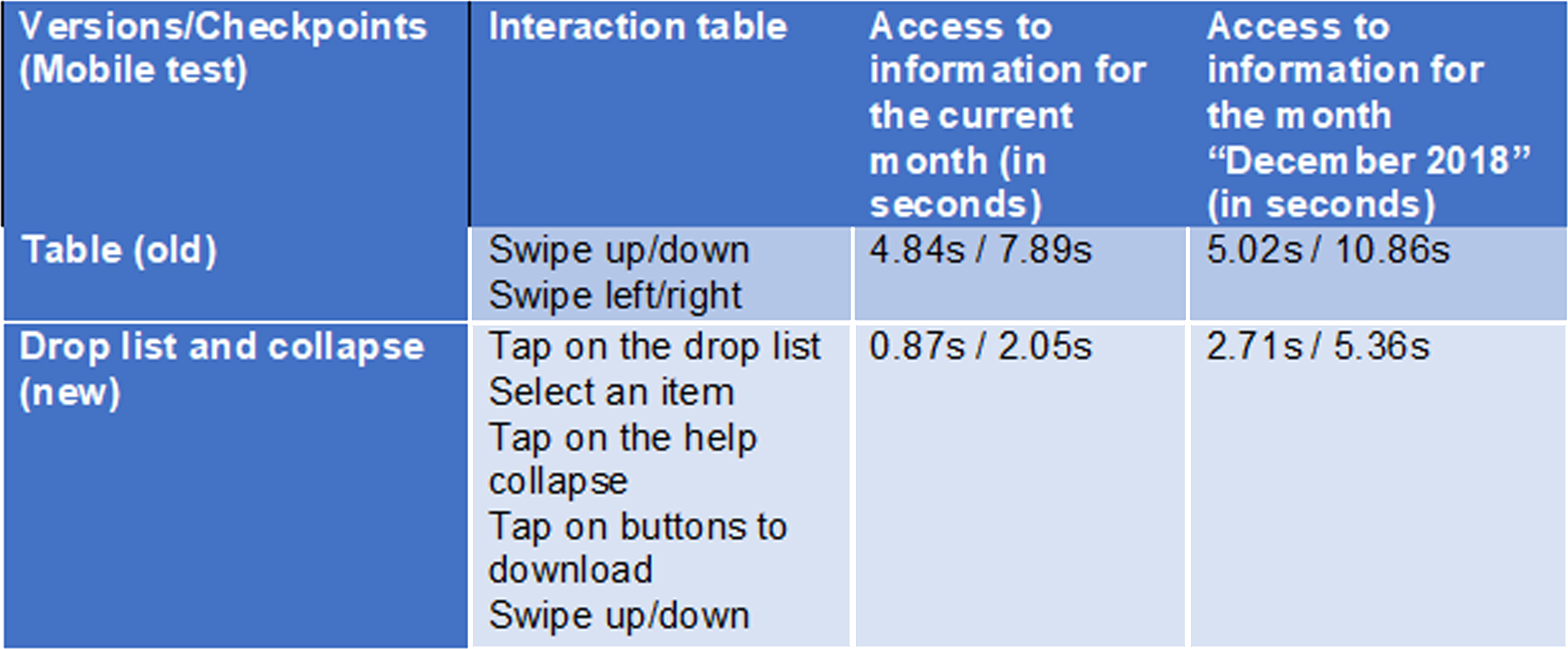
Result after tests
This table recap one of the test we made with users
User Feedback
Users appreciated the clarity of the new calendar, especially its mobile-friendly design. The enhanced user interface made it easier to find and view the correct dates without frustration. Marketing teams valued the new dynamic controls, enabling quicker and more effective campaign adjustments.
Challenges
There was initial confusion regarding the calendar’s presentation, particularly about deferred debit. This was resolved by simplifying the design and integrating helpful explanations directly within the interface. Marketing teams needed additional support to visualize the scalability of the calendar, which was addressed through detailed training and updates.
Key Improvements
The calendar now features dynamic navigation with a clear, mobile-optimized display. UI elements were redesigned to minimize cognitive load, making it simpler for users of all ages to access relevant information. Marketing teams now have tools to easily manage and prioritize offers, improving their flexibility.
Impact
✅ User satisfaction rose by 45%, reaching a 85% approval rate.
✅ Mobile engagement increased, with 60% of users interacting more with the calendar.
Tools Used
✅ MakeMyPersona (Hubspot) for personas design.
✅ Balsamiq Mockups for quick wireframing.
✅ Photoshop for screen design and branding adherence.
✅ Axure for interactive prototyping and design.
✅ Jira for ticketing management.
✅ Microsoft tools for tests/reflection (Forms, Teams, Whiteboard).