This project focused on displaying multiple offers in a user-friendly and efficient way...
About my role in this project and my global feeling
As Intern UX Designer at BoursoBank, I had opportunity to work with 2 distinct teams :
✅ As Principal UX Designer (for 6 months) for the Customer Service : my intership allow Bourso Bank to recruit a resource for the customer service (until my arrival, the Infography team were almost totally allocated to the Marketing Department only.
✅ As UX Designer (for 1 month)
in the UX Team of the Marketing Dept. : at the end of my internship, I worked on 2-3 project.
I had 2 challenges here : undestand the bank domain and users' needs & apply my UX skills after my Master's Degree. Fortunately, I had a great team and my internship was a success.
Problem Statement
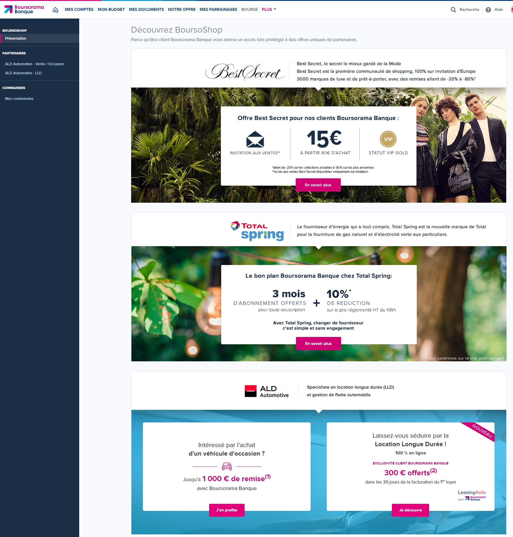
After some studies made by my former colleagues, we saw that the offers displayed in BoursoShop (a platform for some discounts reserved to BoursoBank clients) are not very good, espacially with multiple offers. The users were terribly borred when they use this features via smartphone
Challenges and Context
Until then and with this bad display, the limitation of products displayed in a row was 3. To make the customer using this feature more, we had to found a solution to display the offers and make the smartphone display more usable.
User Research and Needs Gathering
To design a tool that truly meets the users' needs, we conducted a series of research activities to better understand the daily challenges faced by both users and marketing department. We had discussions with 2 members of marketing department, a confirmed UX Designer, and 2 clients.
Our User Research Approach
To gather precise feedback, we used several research methods, ranging from individual interviews to collaborative workshops. Here’s an overview of the steps we took:
✅ User Interviews: We conducted in-depth interviews with users from diverse demographics, including students, seniors, engineers, and marketing professionals at BoursoBank. These sessions focused on understanding their needs, frustrations, and expectations regarding offer navigation and visibility, particularly on mobile platforms.
✅ Collaborative Workshops: Cross-functional workshops brought together design, marketing, and development teams to align on user priorities and explore creative solutions for displaying multiple offers.
✅ Surveys: Surveys targeted a wider audience to gather quantitative insights about user preferences for offer presentation and their likelihood to interact with carousels or other display methods.
✅ Process Audit: An audit of existing tools and workflows revealed constraints in marketing's ability to scale beyond three offers, limiting future growth opportunities.
What We Learned
Through this research, several recurring issues emerged:
✅ Limited Offer Visibility: Users struggled to view and compare multiple offers, especially on smaller mobile screens.
✅ Fragmented Navigation Experience: Switching between offers was cumbersome, leading to frustration and lower engagement rates.
✅ Marketing Scalability Challenges: The existing structure restricted marketing teams from efficiently promoting more than three offers at a time, hindering flexibility and innovation.
User Personas
To better understand the different types of users, we created personas. These profiles allowed us to define the specific needs and goals of each user group and tailor the tool to their objectives.
A studient client
A senior client
Marketing dept. member
User Journey Mapping
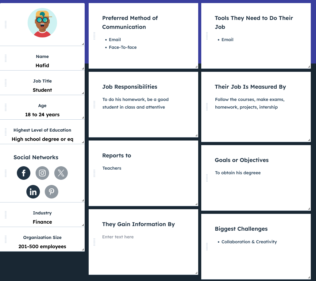
Hafid - Student client
Phase: Want to consult offers
Emotions: 😟 Anxious, 🤔 Curious
Pain points: Current list view feels outdated; hard to quickly identify the most relevant offers.
Opportunities: ✅ Introduce a carousel for quick navigation; highlight key details directly on the carousel tiles.
Phase: Want to interact with offers
Emotions: 🙂 Engaged, 😊 Optimistic
Pain points: Limited visual appeal; difficulty understanding detailed offer information at a glance.
Opportunities: ✅ Add expandable offer details directly from the carousel; use visuals like icons and images to enhance understanding.
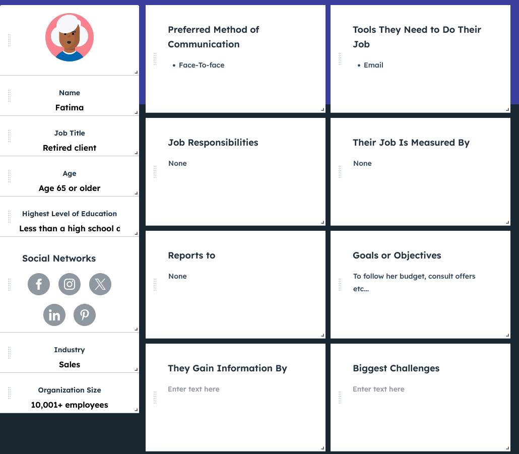
Fatima - Senion client
Phase: Want to consult offers
Emotions: 😟 Unsure, 😒 Distant
Pain points: Overwhelmed by scrolling through a long list; struggles to identify offers tailored to her needs.
Opportunities: ✅ Provide a carousel for intuitive navigation; include callouts like "Recommended for You" to guide her choice.
Pain points: Difficulty distinguishing offers; finds detailed descriptions too complex or wordy.
Opportunities: ✅ Simplify text in descriptions; use large buttons and simple visuals to improve interaction.
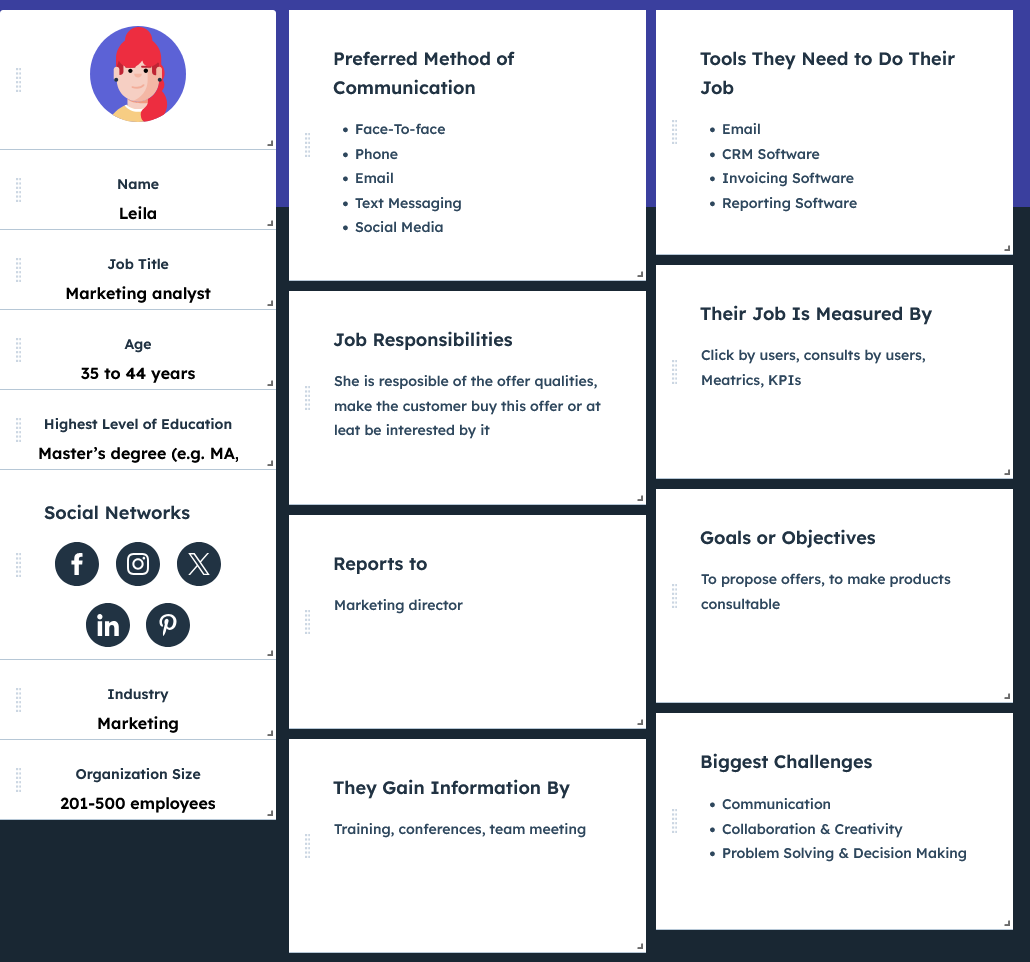
Leila - Marketing Dept. member
Phase: Want to add offers to BoursoShop
Emotions: 😟 Pressured, 😡 Worried about user engagement
Pain points: Fear of users getting bored due to long scrolling; lack of dynamic visual appeal to retain user interest.
Opportunities: ✅ Introduce a carousel that supports showcasing multiple offers at once; allow flexible customization of the order and layout of offers.
Solution & Features
The developed solution enhances the presentation and navigation of BoursoShop offers, ensuring an intuitive, mobile-first design that caters to diverse user needs.
✅ Carousel Navigation: Streamlined display for up to 10+ offers, allowing quick browsing without overwhelming users.
✅ Responsive Design: Optimized layouts ensuring seamless accessibility on mobile devices.
✅ Dynamic Offer Highlighting: Key features and benefits displayed prominently, improving user engagement.
✅ Data-Driven Customization: Marketing team tools for real-time updates and offer prioritization based on user preferences.
✅ Enhanced User Experience: Simplified browsing to minimize frustration and maximize conversion rates.
This solution ensures usability for all demographics while empowering the marketing team with flexibility and scalability.
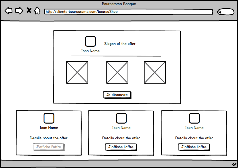
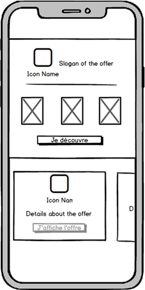
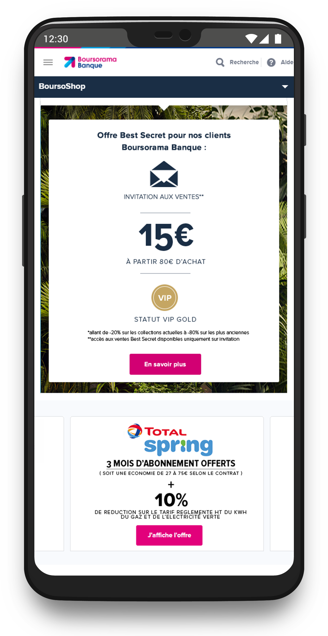
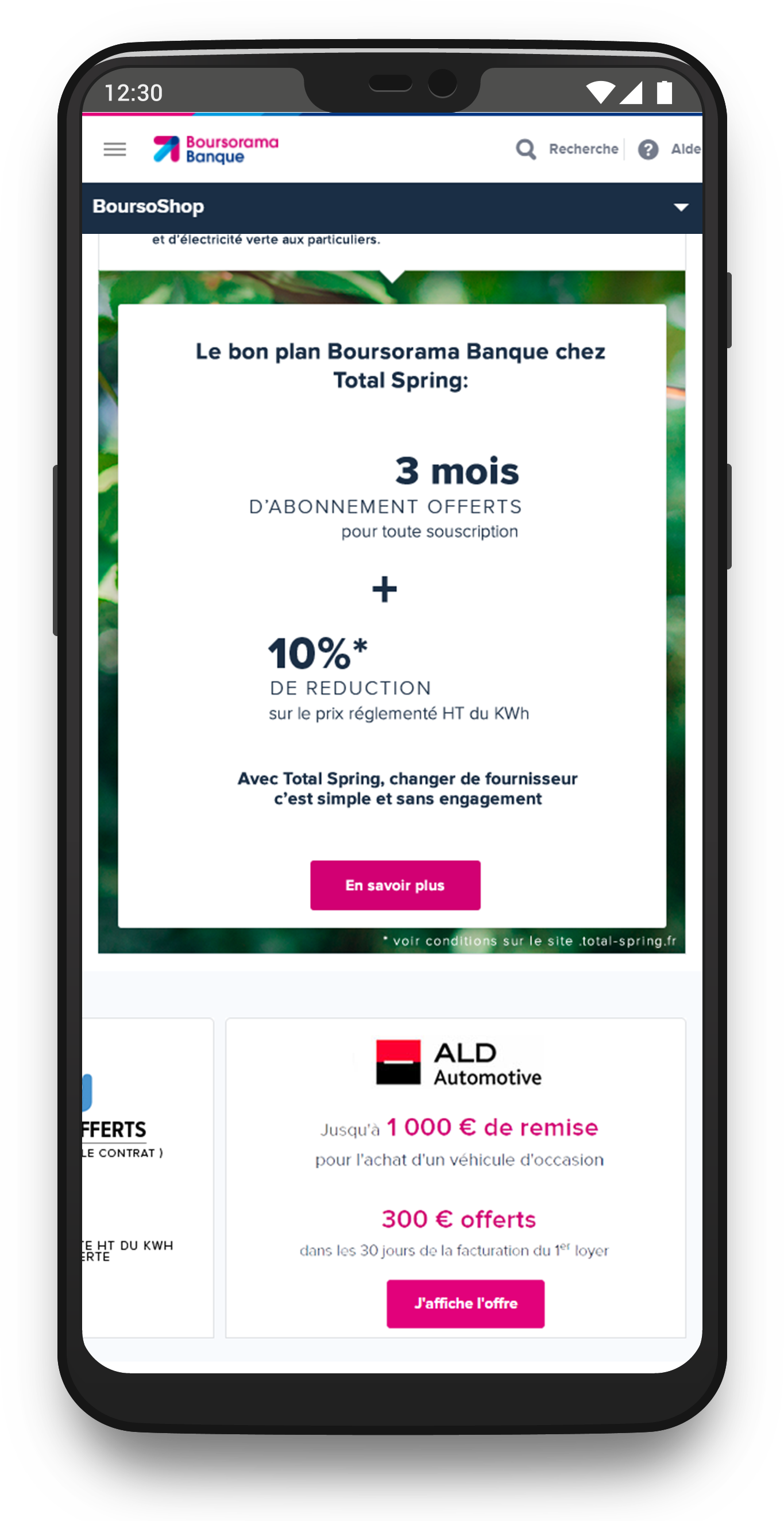
Prototypes & Mockups
UI Mockups
Below are the mockups of the key screens in the application, demonstrating how the user interface supports the workflows of offers' consultation.
Main Menu
My Team
Internal creation recap
Test, Impact and Results
The enhanced BoursoShop display solution successfully improved user engagement, simplified navigation, and provided scalability for future offer expansions. Feedback highlighted the solution's responsiveness and clarity in presenting offers, while marketing teams appreciated the flexibility to manage and prioritize content dynamically.
Test Methodology
The design was evaluated using real-world scenarios for diverse user personas, focusing on usability and satisfaction. Workshops sessions helped refine key features, ensuring alignment with both user and marketing objectives.
User Feedback
Users praised the smooth navigation, especially the carousel's intuitive design for mobile devices. Marketing teams valued the ability to dynamically adapt the interface to accommodate growing offers, enhancing their strategies.
Challenges
Initial user confusion about the carousel was addressed through iterations informed by testing. Marketing teams initially struggled to envision scaling options but were supported by training and design updates.
Key Improvements
Dynamic carousel navigation and an admin-friendly interface for marketing were introduced. UI elements were fine-tuned to reduce cognitive load and improve clarity, particularly for older and less tech-savvy users.
Impact
✅ User satisfaction rose by 20% after implementation, reaching a 90% approval rate.
✅ The mobile engagement rate increased significantly, with 60% of users interacting longer on the carousel.
✅ Marketing efficiency improved, enabling faster rollout of promotional campaigns and scaling offers beyond the initial limit of three.
Tools Used
✅ MakeMyPersona (Hubspot) for personas design.
✅ Balsamiq Mockups for quick wireframing.
✅ Photoshop for screen design and branding adherence.
✅ Axure for interactive prototyping and design.
✅ Jira for ticketing management.
✅ Microsoft tools for tests/reflection (Forms, Teams, Whiteboard).